Layering planner stickers is where functionality meets artistry. For many of us who rely on paper planning for focus, self-expression, and productivity, sticker layering transforms simple weekly spreads into creative keepsakes. With the right approach, your planner becomes a canvas—inviting you to play with depth, contrast, and visual storytelling every time you sit down to plan.
Layering isn’t just about stacking stickers—it’s about building dimension and movement on your page. With our high-quality, thoughtfully designed stickers at Dark Moon Paper, each layer can serve a purpose: drawing the eye, highlighting a priority, or simply sparking joy when you flip through your planner or journal. This creative process turns the functional act of planning into a mindful, engaging ritual.
Before we jump in, consider gathering a few essentials for an effortless layering experience:
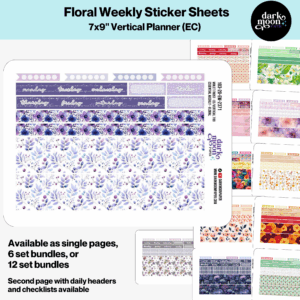
Washi tape acts as the underpainting of your spread. Place strips along the top, bottom, or sides—either straight or at playful angles. Try layering two or more washi patterns for extra interest. Our kits feature coordinated palettes, making this step fool-proof and fun.
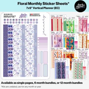
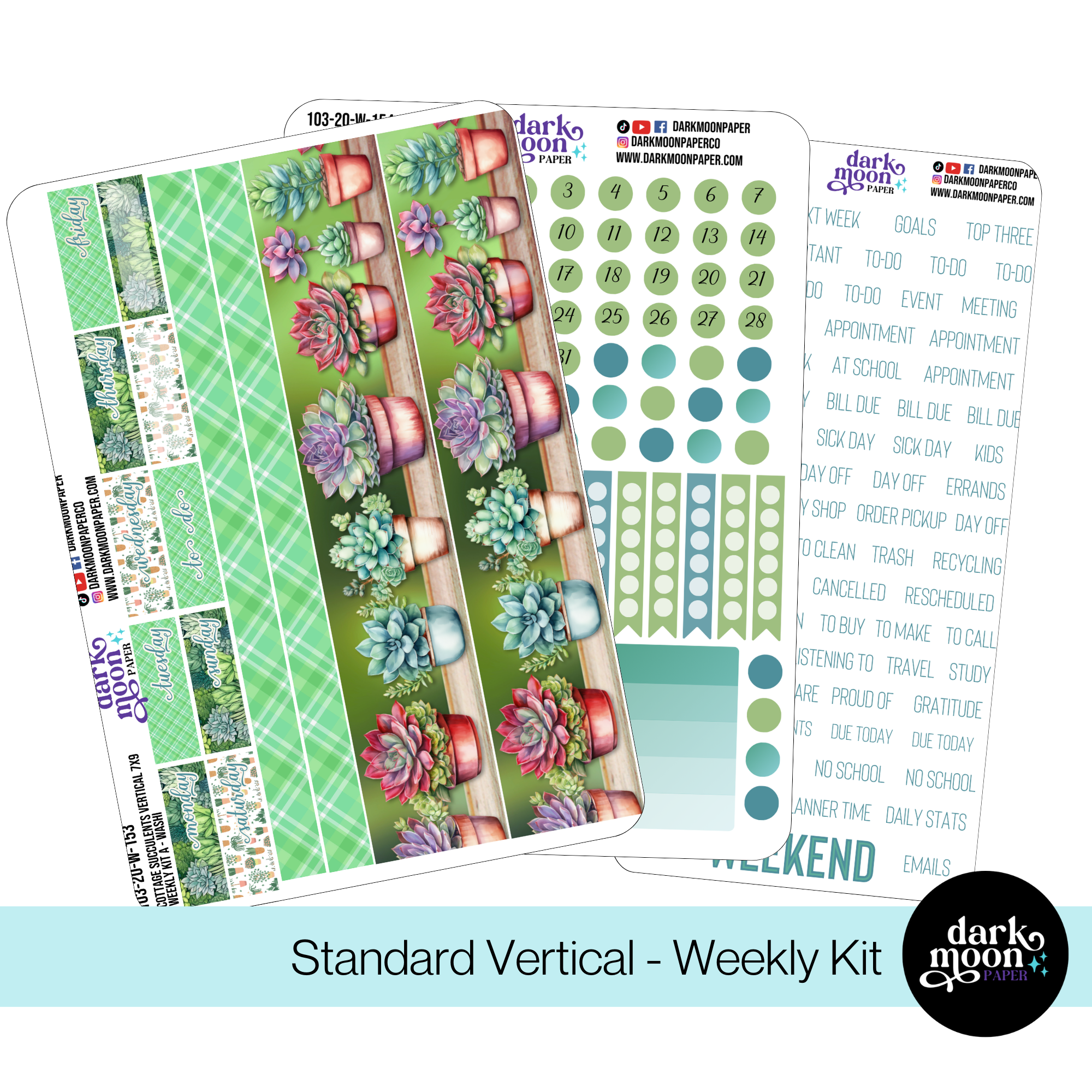
Functional full or half boxes, large florals, or statement illustrations go down next. This anchors your spread and gives your eye a place to start. For example, our Standard Vertical Weekly Kits include beautifully coordinated washi and box stickers perfect for this role.
Slip florals, leaves, or geometric stickers behind boxes and headers—especially at corners or edges. If you’re using clear glossy stickers, you might want to back them with a bit of white sticker paper for opacity. Think of these as your “backdrop,” giving visual weight and soft edges to harsh boxes.
Layer mid-sized boxes, banners, or labels over washi and background decoration, but under your more functional icons. Deliberately offset them (try a slight diagonal!) to create movement and a trending, casual vibe. Our Any Month Kits for Hobonichi Weeks come with mid-size elements perfect for playful overlap.
This is where your spread comes alive! Use icons for appointments, header stickers for lists, and tiny decorative flourishes for whitespace. Place them slightly over corners or edges of other stickers for a deliberate, cohesive finish. Leave some negative space for balance.
Once you’re comfortable with basics, try these techniques for even greater impact:
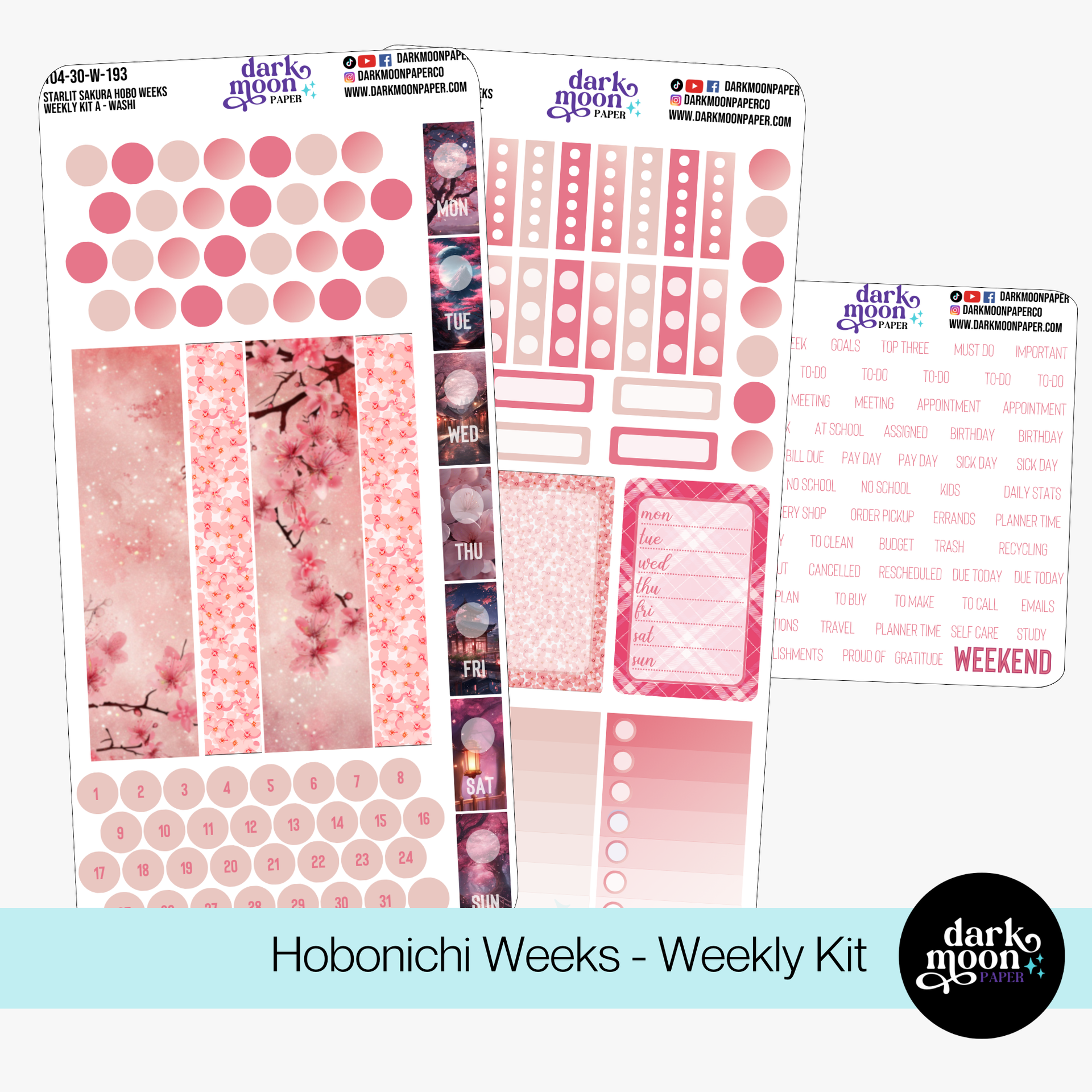
The slim, horizontal layout is perfect for running layered washi along the bottom, tucking small deco off the vertical edge, and stacking functional strips over decorative backgrounds. The Starlit Sakura Weekly Kit offers delicate florals that look stunning when overlapped with boxes and headers.
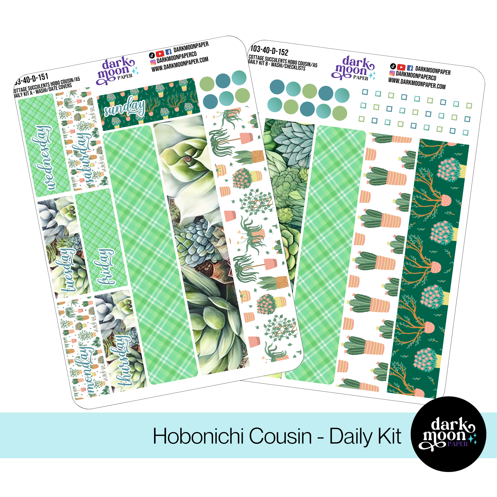
With daily and weekly spreads, this layout thrives on vertical layering. Use tall boxes, dashboard accents, and clusters of foliage for a lush, cascading dimension. Consider our Cottage Succulents Weekly Kit for Cousin for an earthy, refreshing look.
Layer headers, banners, and washi in alternating directions to break up repetitive columns. Overlap embellishments where columns meet, and don’t be afraid to let decorative stickers cross boundaries for a more unified spread. Our Vertical Any-Month Kit is a flexible choice here.

Imagine starting your week with a foundation of pastel washi, layering our soft “Cottage Succulents” floral stickers at the page corners. Top with functional date boxes and headers, then scatter a mix of pastel icons and list markers. Add a translucent overlay or a hand-lettered quote sticker for mood. The result? An energizing, elegant spread you’ll love revisiting all week—and one that gently guides your focus with every glance.
Layering stickers is ultimately about blending organization with creativity—and making your planner truly yours. Every week is a new opportunity to experiment and play. If you’re looking to refresh your collection, explore our curated selection of Hobonichi Weeks Kits, Hobonichi Cousin Kits, and Vertical Planner Kits. Or browse our all-purpose journal sticker sets—each one designed to help you layer with ease and flair.
If you’d like more creative ideas, exclusive freebies, and early looks at new releases, don’t forget to sign up for our newsletter. Here’s to bolder, richer, and more joyful planning every week!