Minimalist Monochrome Planner Aesthetic: 5 Tips for Your Hobonichi Weeks and Cousin Setups

There’s something quietly powerful about a minimalist, monochrome planner. The crisp contrast, calming palette, and clutter-free layouts let your words and intentions take center stage. For those of us embracing the tactile joys of analog planning with the Hobonichi Weeks or Cousin, curating an understated and cohesive aesthetic isn’t just about style—it’s about amplifying focus, reducing decision fatigue, and expressing personality through purposeful restraint.

Why Minimalist Monochrome Is More Than Just a Trend

At Dark Moon Paper, we see the minimalist monochrome approach as a philosophy—one that values calm, clarity, and intention over information overload. Monochrome doesn’t mean boring: it’s a way to elevate essential details, making every stroke of your pen and sticker placement meaningful. In our own journaling routines, this style makes it effortless to prioritize, reflect, and create an environment where even small moments of beauty feel deliberate.

1. Set Your Signature Monochrome Palette

Begin by choosing a palette that grounds your planner pages. Traditional monochrome planning leans on blacks, whites, and pleasant grays—but you can add unique flair by introducing just one or two subtle accent shades (think cool mist blue, gentle taupe, or even a deep charcoal). The secret is restraint: using consistent tones across headers, dividers, and embellishments lets your handwriting and intentions shine through.

  • Use a favorite black gel pen for all main writing (we love the tactile smoothness this brings)
  • Choose light gray or transparent washi tape to divide sections or highlight headers
  • Stickers in cream, graphite, or metallic silver add texture without overwhelming your senses

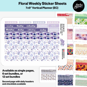
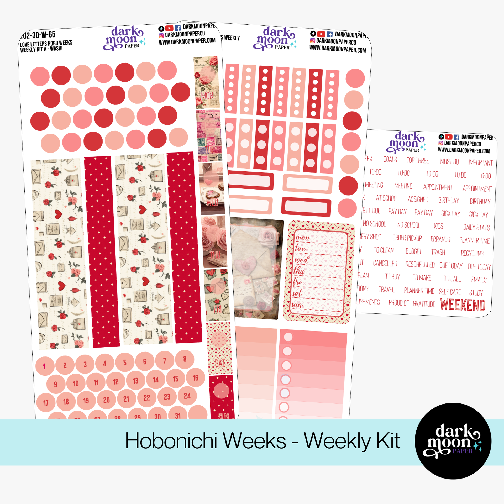
This inspires visual calm and makes it easy to spot important notes at a glance. If you are searching for minimalist kits custom sized for Hobonichi layouts, our Hobonichi Weeks Weekly Kit – Love Letters for monochrome palettes brings soft, adaptable neutrals to each spread.

Hobonichi Weeks Weekly Kit Love Letters
Hobonichi Weeks Weekly Kit – Love Letters

2. Design Intentional and Airy Layouts

Minimalism and monochrome go hand in hand with intentional page design. Resist the urge to fill every millimeter—white space isn’t wasted space; it’s a breathing room for your thoughts! Here’s how to structure an effective minimalist spread in your Hobonichi:

  • Main Section: Reserve 40% for your schedule or key appointments. Simple timed columns or boxes provide structure without clutter.
  • Task List: Dedicate about 30% to immediate to-dos, using square checkboxes or dot bullets in light gray.
  • Reflect & Notes: Use the remaining 30% for ideas, self-care reminders, or a gratitude log.
  • Intentionally leave at least 15–20% as white space to maintain balance and prevent overwhelm.

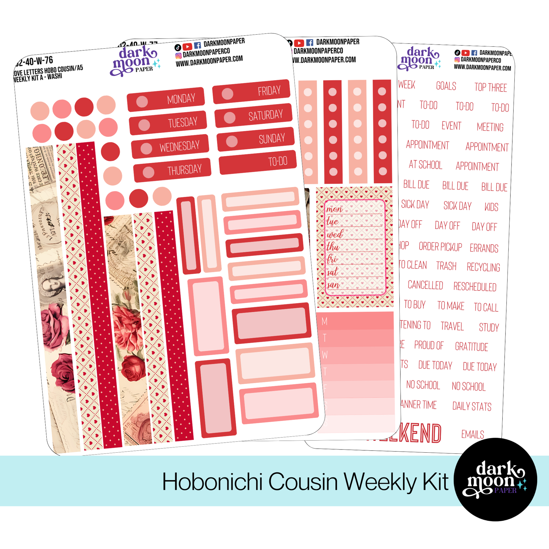
The Hobonichi Cousin Weekly Kit – Love Letters features modular elements perfect for customizing clean layouts.

Hobonichi Cousin Weekly Kit Love Letters
Hobonichi Cousin Weekly Kit – Love Letters

3. Functional Color Coding (With a Minimalist Twist)

Too many colors break the serene spell of monochrome, so keep color coding subtle and purposeful. We recommend:

  • Choose one muted accent (soft blush, pale sage, or blue-gray) for highlighting deadlines or events
  • Use bold black or dark gray for main headers
  • If tracking special events like moon phases or milestones, choose a barely-there highlight so it’s easy to spot without disrupting the harmony

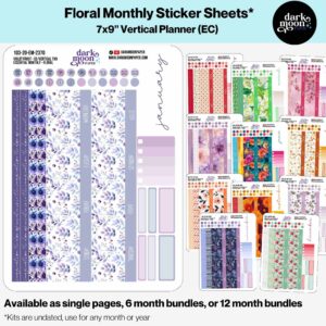
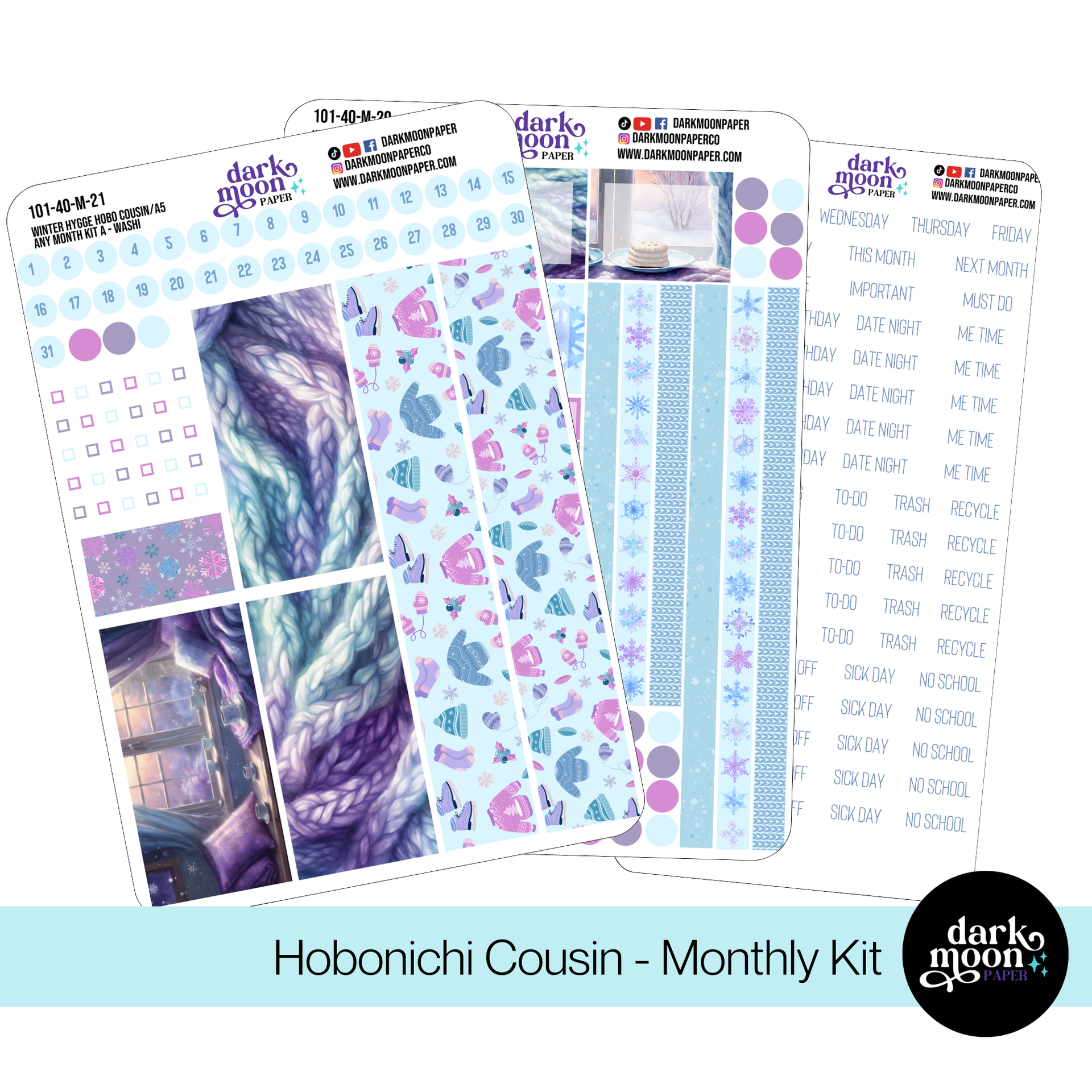
For those craving precision, our Hobonichi Weeks Monthly Kit – Love Letters and Hobonichi Cousin Any Month Kit – Winter Hygge offer neatly sized boxes in calm tones—making color coding a pleasure, not a distraction.

Hobonichi Cousin Any Month Kit Winter Hygge
Hobonichi Cousin Any Month Kit – Winter Hygge

4. Curate a Minimalist Toolkit

Minimalist planning is easiest when your supplies are as intentional as your layouts. We keep our toolkit pared back to only the most essential, tactilely pleasing items:

  • A smooth black gel or rollerball pen for writing and accenting headers
  • A clear or gray-accented ruler for straight, clean lines
  • Light gray or transparent sticky notes and page flags for temporary notes
  • 1-2 sheets of stickers that complement your monochrome palette (no rainbow chaos, just calm synergy!)

Storing your essentials in a compact pouch or drawer ensures you never lose time searching for supplies—making your set-up each day a calming ritual.

5. Establish Consistency With Personalized Details

Consistency is key to the minimalist monochrome look, but don’t forget to add your own subtle touches. Here’s how we do it:

  • Stick to the same minimal headers and icon style throughout the month
  • Use one or two decorative items sparingly—perhaps a tiny geometric sticker, wax seal, or a single line drawing
  • Treat your dashboard as an anchor: refresh it each month with calm monochrome embellishments (see our Hobonichi Cousin Dashboard Kit – Love Letters for inspiration)
  • Photograph spreads weekly—tracking your evolving style can be a meditative, fun process

Hobonichi Cousin Dashboard Kit Love Letters
Hobonichi Cousin Dashboard Kit – Love Letters

Bringing It All Together

Building a minimalist monochrome planner system isn’t about perfection; it’s about the freedom of focus, clarity, and creativity that emerges when you let go of chaos. Allow your habits to evolve: start with a few key changes, then adjust over time as you discover what speaks to you. Whether you’re planning the week ahead, cataloging memories, or organizing your creative projects, this aesthetic encourages mindfulness both on and off the page.

If you’re looking for high-quality, thoughtfully designed minimalist stickers and accessories that harmonize with Hobonichi Weeks and A5 Cousin layouts, browse our latest monochrome-inspired releases on Dark Moon Paper. We believe creative organization can be both functional and artful—let’s make planning beautifully simple, together.

CAN'T GET ENOUGH FREEBIES?

Subscribe to Planner Inspiration!

Get design ideas, planning tips, and exclusive access to contests and giveaways!

We don’t spam! Read our privacy policy for more info.

Leave a Reply

Your email address will not be published. Required fields are marked *

CAN'T GET ENOUGH FREEBIES?

Subscribe to Planner Inspiration!

Get design ideas, planning tips, and exclusive access to contests and giveaways!

We don’t spam! Read our privacy policy for more info.

Table of Contents

Closeup of starbursts from Dark Moon Paper logo

Stickers Made for Planning

Our custom stickers are a fuss-free way to brighten up your planner pages with perfectly-sized designs that add a spark of personality to every layout.

Stylized logo for Dark Moon Paper featuring starbursts and swirling type

Why use planner stickers?

Planner stickers make organizing easy, fun, and personal! Add color, creativity, and structure to every page, transforming your planner into a tool that reflects you. Perfect for tracking, decorating, and staying inspired daily!

New Release Planner Sticker Kits

Recent Planner ideas & articles

Hello and welcome!

I’m Rachael Snow, a lifelong artist and entrepreneur, and I started Dark Moon Paper to blend my love of art, technology, and the mysterious beauty of the world around us. My sticker kits are meant to set the mood, tell a story, and give you a little escape from the ordinary. 

I work from my cozy studio tucked away in the beautiful woods of Oregon, surrounded by nature and a dark night sky full of stars.