Color coordination isn’t just about creating a visually pleasing planner; it’s a way of enhancing your overall planning experience and productivity. At Dark Moon Paper, we believe that integrating cohesive sticker themes can transform your planner from a mere organizational tool into a personalized canvas that reflects your unique style. Let’s explore the art of color coordination and how it can elevate your planning aesthetic.
Before diving into sticker themes, it’s crucial to understand the basics of color theory. At its core, color theory involves the use of color wheels and the relationships between different hues. Key components include:
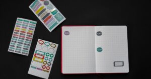
Incorporating a cohesive color scheme into your planner doesn’t only make it look organized and aesthetically pleasing, but it also aids in improving concentration and mood. According to studies, colors can influence psychological functioning, enhancing visual appeal and reducing stress during planning. Adding varying shades (tints and tones) within the same color family can make a planner spread look harmonious and sophisticated.
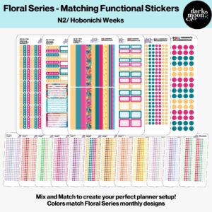
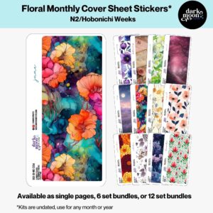
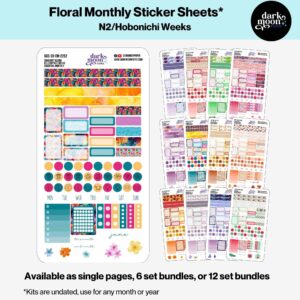
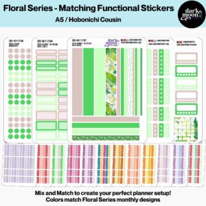
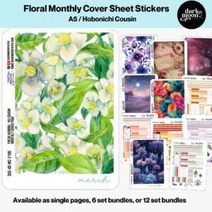
Sticker themes can drastically alter the look and feel of your planner. From seasonal themes that reflect the colors and festivities of fall or spring, to specialized designs like a rustic cottage garden or an enchanted apothecary, each theme sets a distinct tone. At Dark Moon Paper, we offer a variety of themes that cater to different planner formats and personal tastes.
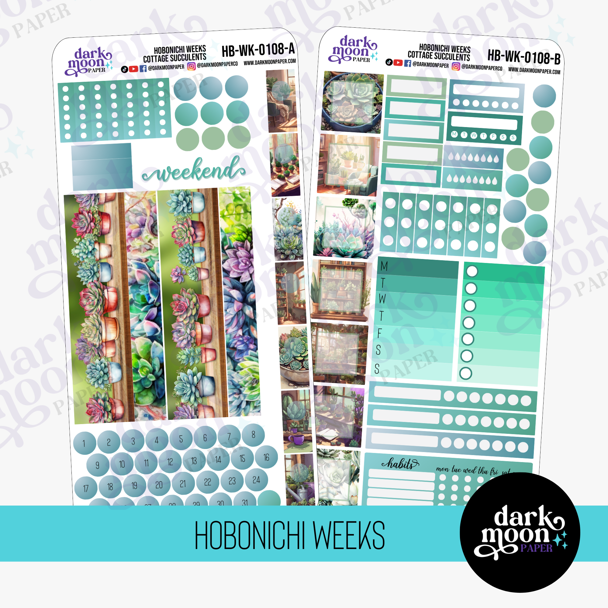
Once you’ve selected a sticker theme, building a cohesive palette is the next step. Use the colors from your sticker collection to guide the rest of your planner setup. For example, if your stickers feature pastel colors, extend those shades into other planner items like pens, washi tapes, and inserts. This creates a unified look that feels connected and thoughtful.
Here are some practical tips to integrate color coordination effectively:
Consistent color schemes bring a sense of elegance and purpose to any planner. Consider seasonal shifts and events in your life that may call for a specific theme. Whether it’s a festival, new year, or a personal milestone, choosing a theme that aligns with these events adds a personal touch.
Incorporating cohesive sticker themes into your planner transforms not only its appearance but also enhances your organizational skills by bringing order and coordination to your scheduling process. At Dark Moon Paper, we are passionate about helping you unlock your creativity while staying organized. For more information and inspiration, visit our website to explore our range of products designed to enhance your planning experience.
Remember, your planner should reflect who you are—unique, creative, and well-organized. By applying the art of color coordination, you open up a world of expressive possibilities. Happy planning!
Learn more about our offerings here.